LetsFly
LetsFly is an application that enables students to book airplanes and instructors for private pilot flight lessons.
Role
User Experience Designer
User Interface Designer
Deliverables
Researching
Persona creation
Site Map
Visual Design
Wireframing
Prototyping
Year
Spring 2022, a conceptual project
Problem
Scheduling is a complex task for people with overbooked calendars. Student pilots are significantly affected by this because their training depends on satisfying multiple constraints imposed by the random variables and constants of flight training.
Some of the variables that affect student pilots are the availability of their instructor, who is also bound by complex scheduling constraints, availability of an appropriate aircraft, which are usually limited, weather conditions, TFRs (Temporary Flight Restrictions), traffic, etc.
Solution
This application aims to help student pilots mitigate the complexities of scheduling flight training and lessons. Students fly on average three times a week, they depend on an overbooked instructor, weather is unpredictable, training lasts about eight months to complete, and most have side responsibilities such as families, relationships, children, and jobs.
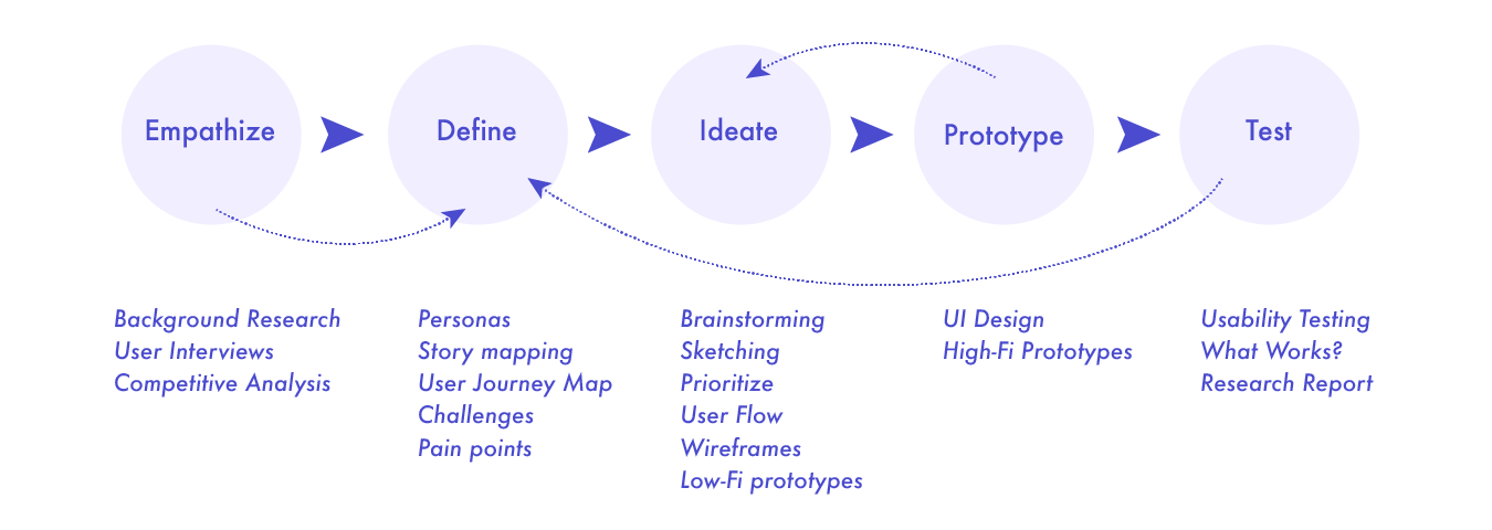
Design Thinking Process
Research Goals
Determine if users can complete core tasks within the prototype of the flight scheduling app. Understand user pain points if the app is difficult to use.
How do students feel about using their current app?
What features do users want in a flight scheduling app?
What can we learn from the user flow or steps that users take to schedule a flight?
User Interviews
I asked current fight students to list the challenges they experience when they book their planes and instructors. The top challenges are:
Complicated to book a plane with a specific instructor
No weather forecasts
No flight restriction forecasts
No metar data
Market Research and Competitive Analysis
There are many scheduling apps to learn what methods they use to guide users to success. For three prominent apps, I noted how they work, the pros, the cons, and the features. I created a table to identify what features each app has and what features are missing.
No push notifications or reminders
No weather forecast
Competitive Research
Defining Solution
Identifying Users
Who is the user?
What goals does the user want to achieve?
What problems does the user experience?
Personas
Based on user interviews, and user reviews I created an empathy map to document high-level behaviors, goals, frustrations, and influences. I channeled this into a persona – a document to guide solutions.
User Journey Map
Users’ challenges and pain points:
Requires too many clicks
Navigating across the calendar is very complex
Plane and instructor schedules are provided on separate screens. The users need mentally merge both calendars to find an appropriate time slot
Personas
User Journey Map
Ideating Solutions
After identifying the user’s pain points, I started brainstorming ideas. The biggest challenge was to come up with a way of syncing the user’s aircraft and instructor calendars together. I came up with a heat map that can hold all information about the user, aircraft, and instructor availability. I also added the weather feature and the sign of the high winds that can help students to be prepared for any weather conditions. The users also can easily access their flight reservations page where they have the option to cancel or reschedule.
Low-Fi Wireframes
The wind barb types. The barb always points in the direction the winds are coming from.
Heat Map Calendar
The user can easily identify what days are the best for scheduling the plane.
Sketches and Ideas
Style Guide
I created a branding style and chose a color palette that would be effective and set the proper mood. I developed a design system to replicate designs quickly by utilizing UI components and elements.
Logo Variations
Design System
Design Progress
Prototype
Hi-fi mockups
After finalizing low-fi wireframes, I created a high fidelity prototype according to the style guide and the user’s flow.
Takeaways
This was my first end-to-end case study that allowed me to learn how to conduct user research, analyze gathered information, and find the best possible solutions for user problems.
Usability testing is needed to identify possible adjustments and improvements.
Take the time to attend to every detail. It can help to avoid mistakes in future design decisions.
It is important to truly study the habits of user and analyze data to produce usable products.


